Portraitures are one specialized area of photography that requires the person behind the lens to capture the expressions and emotions of the subject gracefully. Proper framing and lighting are already basics for you if you’ve been taking portraits for quite some time. However, you need to understand that a lot of work also happens in post-processing, especially in color grading.
For starters, color grading is when the photographer or a visual artist makes some alterations to the tone and feel of the material by adjusting the colors. This is entirely different from color correction, as color correction is just about basic adjustments, ranging from tweaking the white balance and tinkering with contrast and exposure.
Here’s what you may want to consider:
Start with the basics
This means opening your Adobe Lightroom to adjust or correct the colors first. Before you apply any filter or film, you may want to adjust the contrast and exposure. The deeper the contrast and exposure, the more serious and dramatic the photo is, and it may give you a chiaroscuro-like appeal. More exposure and less contrast may render your portraits ethereal and light. Once you’re content with these elements, proceed with the colors.
Stick to the theme
Studio portrait artists and wedding photographers are always mindful of their client’s theme, which will affect the color of the image. If your subject asks for Vanity Fair-inspired aesthetics, check out some of Annie Leibovitz’s works, which are leaning towards warm colors, such as yellows. Some of Peggy Sirota’s works for GQ also follow warm aesthetics. If you want to achieve an elegant yet cool atmosphere, your tones and highlights can lean towards green and blue. You can experiment with this using your Lightroom’s and Photoshop’s color balance, hues/saturation, and curves.
Be careful with the skin
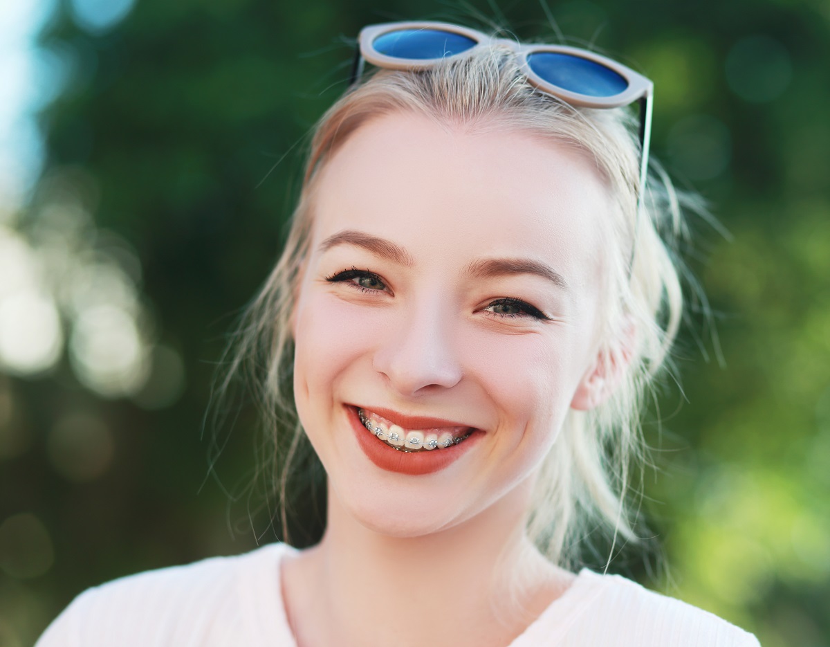
The skin is probably the easiest thing to notice in a portrait, so you need to be careful not to alter the color. Lightroom has a tone curve panel that you can use to achieve the desired tone for the skin. If this is not enough for you, you can check out the saturation and luminance sliders; they can be used for brightening skin tones. Just do not overdo things that the birthmark of your client gets erased. Remember that your goal is to keep things looking natural as much as possible.
Add “fade” if necessary
Fade can be your final step when it comes to grading the color of your photography. Usually, this is used to give your pictures a moody and serious feel. You can achieve it by adding a layer or film of color and then lowering the opacity to subdue the otherwise strong colors of your portrait. You can also use some presets that already have a faded look.
Tinker and try things!
The beauty of color grading allows you to experiment with hues and shades to achieve your desired dramatic look. If you want to be inspired, watch movies with beautiful cinematography. Movies from David Fincher have a distinct yellowish and warm look. And the works of Wes Anderson has that shabby chic and vintage appeal to it.